Wednesday, March 16, 2016

Typography week 9

16/3/2016 (Week 9)
Joshua Low Wai Peng (UIU 300 414 734 )
Typography - Type arrangement part 2


lecture: On that day, Mr.Vinod continue teach material from the previous week. Then, he proceeded on requesting student take show him their progress and also gave feedback on how we should and shouldn't do.


Type arrangement (30%)
Task 1
 (10%): The Letter
In this task, you will write (type) a single page love letter to your beloved who has been abroad for the last 6 months. The year is 1986, the world wide web or internet isn’t yet available to the masses, however the desktop computer has been invented. Letters are still a popular means to send and receive news. As, such it has been your practice to write one letter a week on your new desktop computer, print it, seal it in an envelop and post it to your beloved. This single page letter must be written sensibly and sensitively.
Your task is to use Adobe Illustrator to format this letter in a classical letter writing format (in the days of old) – when letter writing was done by hand – using a suitable font (or a combination of fonts), and appropriate margins, alignment, point size, leading and line length.
You will be required to print two copies; one without creases or folds, the other for postage. The letter for posting will require an envelop, as such thought must be put into the writing of the address on the envelop. You will post this letter to yourself, and you will bring this letter to class for submission and discussion. You will as always document all the processes, drafts and the final results on your e-portfolio.
 Important reading references:
(Note* If you stumble on some additional references, do share the on our Facebook group).
Marking Criteria: Lorem Ipsum…
 Duration: 2 week
Deadline: week 10    

 Progression:
DIAGRAM 1
For the addresses, i went with the choice font of "Pristina" that was available in adobe.
but for the letter context, i went with the font of "vivaldi italic". i decided to go with both this font is because the letter is written on the year 1986. during that time, not much font was available yet and font are hardly digitized. back then, a type writer machine produces fonts that are square-ish which may make the message not really attractive enough to read. Hence, i went with a more calligraphic type of writing to go along in the letter.

Experience:

choosing the font to go with my message was not really easy. i tried using different kind of combination to go with the letter. finally i decided to go with both of this font because from my point of view it really does go along with the message itself.
Observation:
comparing to the first few time using Illustrator, this time things really went much faster. i think its also because of wordings only and not designing, but also know those button surface better.
Findings:
writing a letter would be a really hipster thing to do in this current generation because everyone uses text message, and email. but letter hold its sentimental value and if i really were to write like this and send to my love one, i think they will really appreciate what I've written down for them. the trend of writing a letter to some one is slowly dying off and letter nowadays are normally bills, information update and so. hopefully the trend of writing a letter will not die of just like this.

Wednesday, March 9, 2016

Typography Week 8

8/3/2016 (Week 8)
Joshua Low Wai Peng (UIU 300 414 734 )
Typography - Type arrangement


lecture: due to the limited time i have to be there, mr.vinod quickly reviewed my previous work and gave his feedback. He then proceed on by explaining the task we will do next, which was writing a love letter.

Type arrangement (30%)
Task 1
 (10%): The Letter
In this task, you will write (type) a single page love letter to your beloved who has been abroad for the last 6 months. The year is 1986, the world wide web or internet isn’t yet available to the masses, however the desktop computer has been invented. Letters are still a popular means to send and receive news. As, such it has been your practice to write one letter a week on your new desktop computer, print it, seal it in an envelop and post it to your beloved. This single page letter must be written sensibly and sensitively.
Your task is to use Adobe Illustrator to format this letter in a classical letter writing format (in the days of old) – when letter writing was done by hand – using a suitable font (or a combination of fonts), and appropriate margins, alignment, point size, leading and line length.
You will be required to print two copies; one without creases or folds, the other for postage. The letter for posting will require an envelop, as such thought must be put into the writing of the address on the envelop. You will post this letter to yourself, and you will bring this letter to class for submission and discussion. You will as always document all the processes, drafts and the final results on your e-portfolio.
old-letter Alice-Jackson-StuartkfkhWIb Palmer_Method_sampleRoyal letter 
Above: Classical letter samples
(Note* If you stumble on some additional references, do share the on our Facebook group).
Marking Criteria: Lorem Ipsum…


Duration: 2 week
Deadline: week 10                                                             
research:
the first time learning how to write a letter in the formal and informal letter was back in the schooling days. it was technically learning how to write but we did not practice is and also really sending the letter to some one. finally! a day where i can put what i've learned into practice. i did some brief research on how people normally write a letter and which kind of font they normally use to accommodate the message.

here are some examples below:


my draft letter(pardon my writing):

using different name as i
llustration purposes.

havent really go in depth to which font i would really used to accommodate  the tone for the message. Mr.Vinod said that during the selection of the font, we should take the message we written into consideration, not use only use what font we like, but the font that goes along very well the the message.

experience thus far:
really never wrote a letter before, so during the time i wrote this letter its quite weird. i think learning really how to write a love letter would really discover the romantic and persuasive side of me?(HAHAHAHAHA). i realize my love writing technique really suck big time and i dont know what the heck should i really right to make a person feel or get the message that im trying to tell. hoping to know more in the coming class. bye for now


Wednesday, March 2, 2016

Typography Week 7`

2/3/2016 (Week 7)
Joshua Low Wai Peng (UIU 300 414 734 )
Typography - Ad Expression Part 2


lecture: Mr.Vinod explain to the students that we should have do more research and slowly drafted out the ad rather than rushing to finish it, then he proceeded on teaching us with the slides and also how to further proceed in using illustrator.

final outcome:


diagram 1

diagram 2


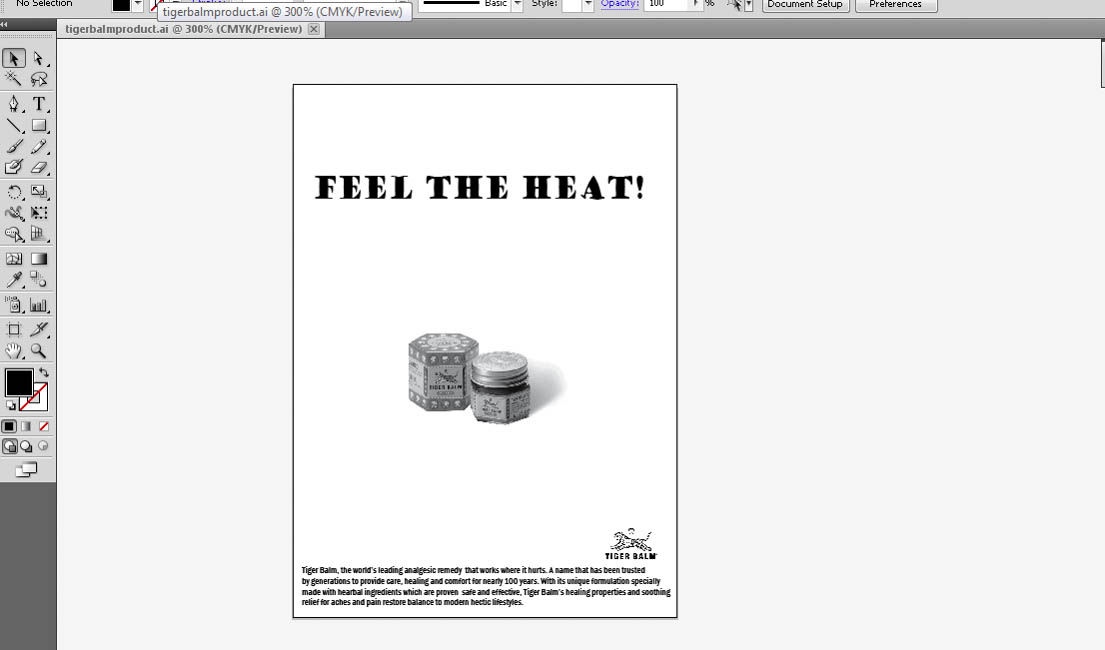
this is the final render that i came out with.


For the word "feel", I did like a curvy and waving line as for the first moment you apply the tiger balm u won’t feel anything. But after a moment, the burning feeling starts to kick in and it will give u like some warm and cold sensation. Besides that, the reason why i use the method of "envelope distort" to make it project like someone screaming, just like when a person gets a burn they will shout out loud "OUCH!!".


feedback from sir:
he told me that he like what i did with the curvy thing and the heat word. he say that i did not bad in this task. he also told me that the word "Feel" doesn't really fit with the word pattern for "heat". so he suggested that maybe next time i can calibrate it properly to fit the word heat because the word heat was fine.
Experience:
i feel that this time i did it on a rush although research has been done. i should have taken the time to slowly draft and think about what should i do at the end, not finish it on the start of the task as it was given to us to finish in 2 weeks time.
Observation:
i think i'm improving and getting better hold of illustrator and also designing and creating new stuff.
Finding:
i kinda like the idea i went with this time and working within the time frame has improved since the last task.

Tuesday, February 23, 2016

Typography WEEK 6

24/2/2016 (Week 6)
Joshua Low Wai Peng (UIU 300 414 734 )
Typography - Ad Expression


lecture:did not get to attend the class on previous week, but i've reach out to some of my classmates to check on what should we be doing on this week.


Task 2
(10%): Ad Expression
You are required in this task to express the headline of a black and white advertisement for Tiger Balm. The ad must express to the type the inherent meaning of the words in context of the Ad.
The copy for the Ad is as follows:

Headline: FEEL THE HEAT!

Copy: Tiger Balm, the world’s leading analgesic remedy that works where it hurts. A name that has been trusted by generations to provide care, healing and comfort for nearly 100 years. With its unique formulation specially made with herbal ingredients which are proven safe and effective, Tiger Balm’s healing properties and soothing relief for aches and pains restore balance to modern hectic lifestyles.
Logo & Product:
TigerBalm-logo-1


TigerBalmProduct


You may use minor graphical elements like lines or dots (if relevant or needed) to aid in the expression of the headline. This is not a visually driven Ad, so do not give undue attention to the product or logo, emphasis is on the headline and copy.
Black and white Press Ad.
Newspaper: TheSun
Size: 128 w x 178 h
Outline around Ad: 0.5 pt stroke width
Mode: Black & White
Marking Criteria: Your work will be judged on whether you have been able to express the meaning or action of the headline through your designs. The designed headline in the type expression task must showcase sensitivity and creativity in the choice of font, its relevancy and its suitability in context of the Ad. It must reflect the inherent meaning of the headline. You will be judged on whether you have demonstrated critical thinking and exploration, research capability, ability to chronologically document your process and reflect on your journey. This evidence must be visible in your postings in the e-portfolio and your in-class process work. 

RESEARCH:
i did some research on searching how tiger balm normally place their ads. while searching, i stumbled on this particular ad by tiger balm, which i believe it was use in the early days.(diagram 1)


diagram 1. 
The interpretation of the slogan which i believe is that the medication is strong. This ad shows only the slogan and some Chinese words along with the tiger balm's logo. This ad is simple and it brings out message to the audience.
on the other hand, there are few modern ads  that i found regarding tiger balm. these ad features graphic in the background along with the slogan overlapping the graphic. It really does make the slogan stand out with the help of the graphical background of athlete as u can see in the diagram below.

Diagram 2(left),3(right).  


i realized that with the help of graphical background, it really does help to make the slogan stand out a lot and people can easily get what is tiger balm ad trying to say.

Furthermore, i did some research on nando's ads. Nando's is famous for their grilled meat menu's around the world. i notice that they gain plenty of popularity for their tongue-in-cheek advertising campaign, poking fun of companies and politician. with just few simple words or sentences, it can provide the sense of humor to the person reading and it draws their full attention the the poster/ads. the fonts that they use, and how they arrange it makes it look more funkier, funny, more interesting to read. here are some of the examples:
 

 diagram4

 diagram 5
diagram 6

                                                                         diagram 7
                                                                       diagram 8
diagram 9
as you can see, nando's always anticipate in something new and fresh in the news. so they always create a new ad when there is a something newsworthy coming up very fast. they are good in grabbing the opportunity to strike at the right moment.

                                          
diagram 10first rendering after obtaining feedback's on what should we do. still trying on other setup for the ad to make it look more attractive. i personally feel that this ad looks abit outdated kinda look. nothing really attractive looking.
diagram 11
this is the second rendering without the product and only the wording at the center. IMOO, i think it looks like one of the nando's ads.lol


diagram 12
i tried to tilt and twist the word to make it going gradually bigger and longer, like a person shouting out his words.

                                          
diagram 13
this time i tried different kind of setting. i try to make the words like its on a burning sensation, small and slowly to big fire and little big wavy kinda look. 

Experience thus far:
this time i tried to do things differently and also creating something new especially at the diagram 7. it was a new lesson learn on how to create and construct fonts like thee on diagram 7. but i am still trying to do some research on other brands that only uses words to bring out their message, just like how Nando's has always did.


Wednesday, February 17, 2016

Typography WEEK 5

17/2/2016 (Week 5)
Joshua Low Wai Peng (UIU 300 414 734)
Typography - Type Expression


Lecture:
CHINESE NEW YEAR, SO THERE WAS NO CLASSES ON THAT DAY. BUT MR.VINOD ASK US TO DIGITIZED OUR WORK FROM THE PREVIOUS WEEK.


Instructions
Type expression (20%)
Task 1(10%): Single word expression

Identify 4 words that describe you. You will then express typographically the meaning of these words without the aid of a visual. You are only allowed to manipulate the type to express the inherent meaning of the chosen words.
Upon approval digitize your artworks using Adobe Illustrator and print them out. Update your e-portfolio throughout the task and ensure every aspect of the process is documented methodically.

Marking criteria
Your work will be judged on whether you have been able to capture the meaning or action of the chosen words through your designs. The designed words in the type expression task must showcase sensitivity in balance, proportion and composition. It must reflect the inherent meanings of the words. You will be judged on whether you have demonstrated critical thinking and exploration. This evidence must be visible in your postings in the e-portfolio and your in-class process work. 

process:
final draft before the work to digitizing begin.


this is the final outcome after all the editing and advise gave by Mr.vinod to me. i change quite a lot of stuff because i did something wrong in the previous drafting and Mr.vinod requested me to view my fellow classmates blog.

Experience:
it was a confusing task for me as i previously had done something out of track. but with the guidance that i get from my friend and also my lecturer i was able to slowly get back on track and finish what i've started. reviewing tutorial from youtube is also one of my method in pulling of this task. it was a chaotic moment for me. overall i enjoyed the process of creating and digitizing the work and have also gain some new insight on illustrator.

Observation:
due to Chinese new year and some problems occuring at home, i was not able to really focus on what am i doing. but as i slowly progress thru, i've learn the ups and down in using illustrator(gave me hard times for abit).

Findings:
its good to know that the words really fits in to the font chose and how it carries the meaning out and i'm very happy about the final outcome. i wish to further explore illustrator and will try to process faster in my work.

Thursday, February 11, 2016

Typography Week 4

11/2/2016 (Week 4)
Joshua Low Wai Peng (UIU 300 414 734)
Typography - Type Expression


Instructions:
In before the class session takes place by presenting one second task to all of the classmates, Mr. Vinod reminded us and also gave some tips on how to update our blog in a simple and brief way so that is it easier for us to manage. Sir then gave everyone a heads up on when and where we should ask him questions about our progress and not doing it on last minute. He uses me as an example to tell the class that i seek for his advise days before the assignment is due. He then proceed on telling us how should a photo been taken in a proper way to upload it to the blog. After the briefing done, we took our turn to present what we had done for task 2. After all the sharing session from fellow classmates, Mr. Vinod proceed on teaching us about types of fonts and ask us to create our on font by using words to describe ourself. he ended the class session by introducing a new task.


Type expression (20%)Task 1: Identify 4 words that describe you. You will then express typographically the meaning of these words without the aid of a visual. You are only allowed to manipulate the type to express the inherent meaning of the chosen words.
Draw two 7cm squares on an A4 graph paper using a pencil. Ensure the boxes are centered vertically and horizontally in the A4 paper. Do the same for two other sheets of paper to obtain 4 squares in total.
Draw and express you respective words. Upon approval digitize your artworks using Adobe Illustrator and print them out. Update your eportfolio throughout the task and ensure every aspect of the process is documented methodically.
Marking criteria: Your work will be judged on whether you have been able to capture the meaning or action of the chosen words through your designs. The designed words in the type expression task must showcase sensitivity in balance, proportion and composition. It must reflect the inherent meanings of the words. You will be judged on whether you have demonstrated critical thinking and exploration. This evidence must be visible in your postings in the eportfolio and your in-class process work. 
Process

diagram 1this was my first draft after i did returning home after the class on that day.came out with quite a few drafts and decided to use these few words and fonts and my first draft.
"more process will be uploaded soon."
Experience:
so far from what i word i have chose and created that suits my personality the most, i think that there is more space for me to tweak things around and make it more into the character. the reason behind creating the font for "outgoing" was because i personally like to explore new things rather than sitting at home doing nothing. hence, the result of different patterns that occur in the font which makes it more lively.

obersevation:
throughout the trial and error, i realized that once again creating a font that suits the word itself aint easy. but it is also something new again for me to explore and create better outcomes.

Findings:
most of the word came to me by getting feedback from relatives and friends about how am i in person when they first and after they met me. but research is still needed to enhance the progression of my work.

Wednesday, February 3, 2016

Typography WEEK 3- continuation of week 2's task

2/3/2016 (Week 3)
JOSHUA LOW WAI PENG (UIU 300 414 734)
Typography

WEEK 3 continuation of assignment

lecture: On Wednesday, Mr.vinod went with a brief summary of what we were doing last week and will be using that material to continue this week's progress as it was a 2 weeks on going assignment and also what were we going to do on that day. Then, he proceeded on reviewing our work. he steadily go through everyone's font and giving feedback and advise on how the font should look like, how it should been and how to draw it out correctly in a simple and faster way. after the private 1 on 1 session with students, he then continue his lecture by asking student to start up their laptops and open up the software needed which was Ai(adobe illustrator). After everyone was ready, he then proceed on  showing step by step on how to draw a letter using the particular Ai software. after the guide session given by Mr.vinod, he required students to practice and learn up most of the things that he taught so that student can question him about things that they do not know about. it was a 30 minutes error and learning session before ending the lecture session.

The videos below should be viewed at a later stage of the task, when students are more knowledgeable and ready to digitize their letters.
Marking criteria: You will be judged on your creativity; the aesthetics of your letter and how consistent are they with regard to their character or personality – do they look like a family of characters. You will be judged on whether you have made the appropriate research and analysis of other typefaces, whether you have demonstrated critical thinking and exploration. This evidence must be visible in your postings in the eportfolio and your in-class process work. 
Duration: 2 weeks
Deadline: week 3
Type expression (20%)Task 1: Identify 6 words that describe you. You will then express typographically the meaning of these words without the aid of a visual. You are only allowed to manipulate the type to express the inherent meaning of the chosen words.
Draw two 7cm squares on an A4 graph paper using a pencil. Ensure the boxes are centered vertically and horizontally in the A4 paper. Do the same for two other sheets of paper to obtain 6 squares in total.
Draw and express you respective words. Upon approval digitize your artworks using Adobe Illustrator and print them out. Update your eportfolio throughout the task and ensure every aspect of the process is documented methodically.
Marking criteria: Your work will be judged on whether you have been able to capture the meaning or action of the chosen words through your designs. The designed words in the type expression task must showcase sensitivity in balance, proportion and composition. It must reflect the inherent meanings of the words. You will be judged on whether you have demonstrated critical thinking and exploration. This evidence must be visible in your postings in the eportfolio and your in-class process work. 
WEEK 3 PROGRESS:
                                          
DIAGRAM 1
This was my font that i came up with. the feedback that i got from Mr.vinod was the font looks fine but he wanted the font to be in a more simpler way by removing more dots. therefore the first from the top was my final font lining up as the second one from the top was having too many dots in it. then i proceed on letting Mr.Vinod to check my work again before proceeding and he gave me the green light to proceed.
 DIAGRAM 2
this was my first rendering  after i finished. i then message Mr. Vinod to get some feedback on what i'm currently doing. He suggested me to align the dots properly and moving the "a" tail to the side to make it look more tidy.
DIAGRAM 3
TADAAA!! this was my final rendering of my own font. it does look better after tidying up the dots spacing between the line and also moving the "a" tail to the side(thanks sir for the suggestion!hehe).

Feedback:
1.Font looks fine but Sir wanted the font to be in a more simpler way by removing more dots. therefore the first from the top was my final font lining up as the second one from the top was having too many dots in it.
2. he also suggested me to align the dots properly and moving the "a" tail to the side to make it look more tidy.

Reflection


Experience:
Learning about different fonts allows me to gain more knowledge about origin of different fonts. in each fonts lies a different message that it would like to bring forth. i was able to draft out some of my own fonts and might put it into use. it may be another challenging task for me to pull through, but in each time during the learning process i pick up skills to think, draw, create something out of nothing. There are so many fonts out there which u can just find, and the hardest part is to create another font of yours. But in the end, i think that i did a fairly nice job in creating my own font which looks much more simple and easier to be read.
Observation:
I still find myself not satisfy with the draft outcome because it wasn't drawn nicely.(kill me please). i think that is the cause of wanting to finishing something in a perfect way. i tried to draw lines by free hand and the out come was better than i expected it to be. at the end of the final font, i feel that it looks much more better comparing to the one i did previously and it may seems easy to draw it out in the iluustrator, but the allignment of the letters ain't easy as u have to really align it properly according to the grids.
Findings:
 My freehand drawing is having some slight improvement as mentioned previously, i rely a lot on tools that is available. also i'm able to do things my own way for instants, using my own way to draw,create new patterns that is needed to accomplish the task given. Also, i really love this font i may be putting it to use in the future, maybe?? well overall it was a great experience to develop my own font and also get to polish back what ive forgotten in using illustrator.