Joshua Low Wai Peng (UIU
Typography - Booklet Part 2
Lecture: Mr.vinod begin to review classmate's work progress once the class started. he then gave us time to further improving our work and also giving advise to students on the spot.
Task 2 (20%): The Booklet
Your task requires you to come up with 10-12 lines about your self. The lines can vary in the number of words (1 word, 5 words, 10 words). These lines will be arranged and expressed according to their meanings. Utilize the knowledge gained in all the tasks previously and express yourselves.
Your task requires you to come up with 10-12 lines about your self. The lines can vary in the number of words (1 word, 5 words, 10 words). These lines will be arranged and expressed according to their meanings. Utilize the knowledge gained in all the tasks previously and express yourselves.
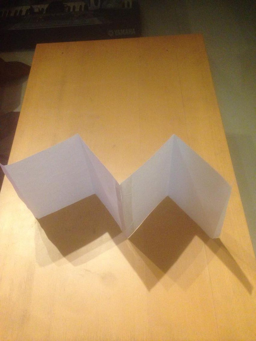
The booklet you are creating has 8 pages in all (2 A4 sheets stuck together and divided into halves). The format of the booklet is an accordion fold and affixed on either end with a card-board.
You have to compose your lines on the various pages, using a variety or appropriate fonts/typefaces, and then considering the size, impact of the respective artworks, place them in an appropriate sequence to ensure a healthy variation from page to page.
A demonstration of this shall be conducted in class. How to fold, how to create your illustrator template and how to place the typographic artworks (expressions of the different lines) in illustrator.
You will submit, a hard copy print out and upload the respective JPEGs of the 8 pages in spreads of 2 onto your e-portfolio.
Marking Criteria: Your work will be judged on whether you have been able to express the meaning of your sentences through your typography and layout (arrangement). The layouts must showcase sensitivity and creativity in the choice of font, its arrangement, its relevancy and its suitability in context of the sentences. It must reflect and enhance the inherent meaning of the sentences.
You must look at the arrangements for all the pages and decide whether the pages look like a cohesive unit, whether there is a level of consistency or variation, so as to avoid monotony or over-consistency.
You will be judged on whether you have demonstrated critical thinking and exploration, research capability, ability to chronologically document your process and reflect on your journey. This evidence must be visible in your postings in the e-portfolio and your in-class process work.
Duration: 2 weeks
Deadline: week 12
Process:

this is my final draft that i decided to go along with.


experience:
it was really a fun time thinking how to create your own style for the booklet and how to arrange the wordings,Folding, cutting and creating the booklet itself. i choose to go with some capital letters with different font it because every word tells a story. it doesnt only comes within the sentences, but it has a deeper meaning in the word itself. hence i decided to make it bolder and also more outstanding comparing to the normal words.
observation:
aligning the papers to the cover page took a long time to get accurate measurements.
findings:
cutting the board was a fuss due to alignments!! but for me i think that when everything combined it turned out pretty good, well at least for me. overall its a nice task to do, something abit more different than just typing.


